Components and Controls
Here you will find detailed descriptions of the components and controls utilized in the Platform.
Component | Description |
|---|---|
3 Dot Menu | Users can conveniently access campaign-related functions such as Pay, Edit, Copy, and Delete via the menu. 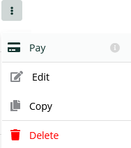 |
Accordion | By toggling the up/down arrow, you can expand or retract the child elements of the component. 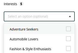 |
Checkbox/Multi-Selections | Checkboxes and Multi-selections enable users to choose one or multiple items from a list. 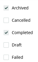 |
Filter | The Multi-Select filters enable users to selectively filter items from a range of standard categories for display in a list. 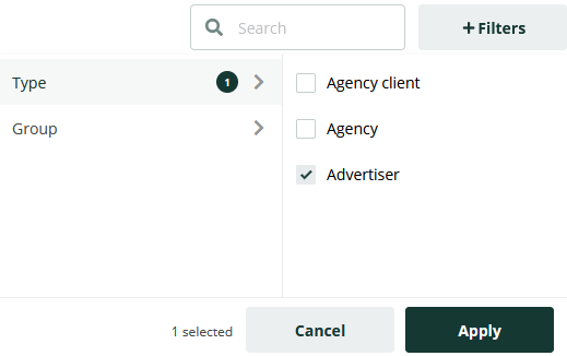 |
Toggle On/Off | This component allows users to enable or disable selectable options. It is utilized for activating or deactivating specific functions, as well as allowing or restricting platform features. 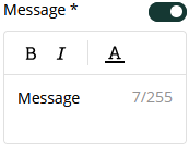 |